
Testing DML Pattern Plotting
Examination of DML pattern clusters across treatment
Includes test R script and output from Geoduck Day 10 5x coverage significant pvalue DMLs after running MACAU
library(ggplot2)
info <- read.csv(file="day10-pred.csv", header=T) #load predictor variables
counts <- read.csv(file="5_Day10.macau.meth5x.txt") #load count data
sigs <- read.csv(file="5_Day10_5x.assoc.txt", sep="", header=T) #load MACAU results
sigs <- subset(sigs, pvalue<0.05) #Subset MACAU results to sig P values only (switch to qvalues in future)
data <- merge(counts, sigs, by="Site") #Merge counts data with significant pvalues by Site (scaffold)
data.num <- data[,2:13] #truncate to numeric data only
scl.data <- scale(data.num, center = TRUE, scale = TRUE) #Scale and center the data to generate z-scores - look into options for scale, think about logit
scl.data.df <- as.data.frame(scale(data.num, center = TRUE, scale = TRUE)) #create dataframe
info$Treatment <- ordered(info$Treatment, levels = c("Ambient", "Low", "Super.Low")) #order the treatment levels
set.seed(123) #set seed for clustering
fit <- kmeans(x = scl.data.df, 6) #fit the data to chosen cluster number
fit$cluster # List cluster assignment
x <- fit$centers # List cluster center (mean)
clusts <- data.frame(t((x[c(1:6),]))) #create transposed dataframe
colnames(clusts) <- c("c1", "c2", "c3", "c4", "c5", "c6") #rename columns
which(fit$cluster==1) #identify indices of cluster
ind <- order(info$Sample.ID) #order by Sample.ID
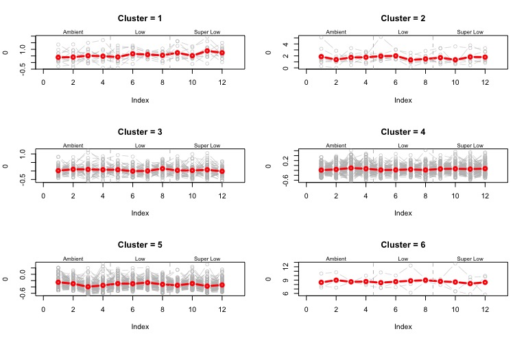
##### Plot Expression by Cluster #####
par(mfrow=c(3,2)) #set graphic layout
for(j in 1:6){ # for cluster in 1:n
clust1 <- t(scl.data.df[fit$cluster==j,]) #transpose the dataset dataframe within a cluster
plot(0, type="n", xlim=c(0,13), ylim=range(clust1), main=paste("Cluster =",j)) #plot an empty plot
for(i in 1:ncol(clust1)){ # for columns in each cluster groups
points(info$Sample.ID[ind], clust1[ind,i], type="b", col="gray", lwd=0.5) #plot points arranged by sample id
}
points(as.numeric(info$Sample.ID[ind]), clusts[ind,j], type="b", ylim=range(clust1), col="red", lwd=3) #plot cluster means
abline(v=c(4.5, 8.5), lty=2, col="grey") #add vertical lines between treatment groups
mtext(side=3, at=2, "Ambient", cex=0.5) #add text to each treatment group
mtext(side=3, at=6.5, "Low", cex=0.5) #add text to each treatment group
mtext(side=3, at=11, "Super Low", cex=0.5) #add text to each treatment group
}
Code output
Figure - mean z-score of count data for each cluster is shown in red, and individual z-scores for each cluster shown behind in gray
Written on February 15, 2017